Introducing The Osaka Metro NiNE Logo
2019.01.15


Written by: キタちゃん(Kita chan)
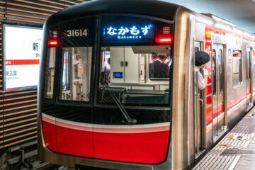
● We have 9 lines in 9 colors.
We’d like to take you behind the scenes to talk about our design and how we arrived with this logo.
Everyone knows that image is important and we worked really hard to get this image just right. Our main goal was to show off how colorful the metro is and to emphasize all the different places we can take you.
![]()
We have 9 lines in 9 colors, both on the metro and on our logo. Some are straight up and down, others go across, and some run on a diagonal.
![]()
You have to take a close look, but those lines are actually arranged to show our initials O, M, N. The whole image represents an O, with an M in the top left, and an N in the top right.
![]()
![]()
We hope you’ll have many more chances to see our logo in the future!
Recommended Plans
“Along the Osaka Metro Lines” Series:
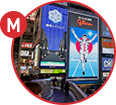
The Midosuji Line (South)
Following the last article about the northern part of the Midosuji Line (Namba …
2025.08.29

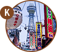
“Along the Osaka Metro Lines”
Series:《The Chuo Line West》
Here’s the issue two of the series that introduces the characteristics and charms …
2025.04.11

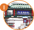
Osaka Metro NiNE’s Communication Tool
Supporting Your Osaka Trip♪
You’re on your long-awaited trip to Osaka♪ You have so much to do—see cool sights, do some …
2024.06.21
Recommended Plans